Data Visualization Via MATALB (1d line plots)
create time: 2019 03 20
MATLAB #Plot
Data Visualization Via MATALB 1 dimensional data
MATLAB is a power software in scientific calculations and its plot ability is also useful. I want to summarize the most frequently used MATLAB code accoring to my usage.
plot multi lines in the same figures
The first code is how we plot multilines in the same plot. I want to add some extra settings in this code for the default settings are not so beautiful. The following is the plot of different functions:
1 | numx=200; |
In above figures I redefined the linewidth of the lines and ticks,changed the fontsize of legend,label etc.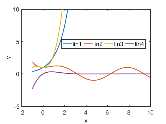
Plot different lines by using different y axis
In some cases we need to plot different things in the smae plot but their number and meanings are different and are not suitable compared directly. We may need the double yy plot.1
2
3
4
5
6
7
8
9
10
11
12
13
14
15
16
17
18
19
20
21
22
23
24
25
26
27
28
29x = linspace(0, 10);
y1 = sin(3*x);
y2 = sin(3*x) .* exp(0.5*x);
figure(1)
subplot(2,1,1)
yyaxis left;
plot(x,y1,'Linewidth',1);
title('yyaxis');
xlabel('X-axis','fontname','times newroman','fontsize',15);
ylabel('left Y-axis','fontname','times newroman','fontsize',15);
yyaxis right;
plot(x,y2,'Linewidth',1);
ylim([-150,150]);
ylabel('right Y-axis','fontname','times newroman','fontsize',15);
%set(gca,'linewidth',1.5,'fontsize',15)
% plotyy
subplot(2,1,2)
x = 0:0.01:20;
y1 = 200*exp(-0.05*x).*sin(x);
y2 = 0.8*exp(-0.5*x).*sin(10*x);
[hAx, hLine1, hLine2] = plotyy(x,y1, x,y2);
title('plot yy');
xlabel('Time (\musec)');
ylabel(hAx(1), 'Slow Decay'); % left y-axis
ylabel(hAx(2), 'Fast Decay'); % right y-axis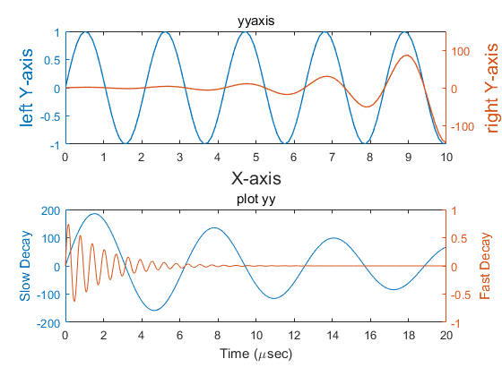
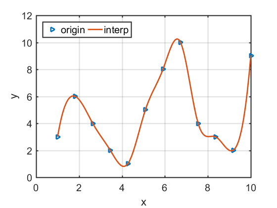
Plot the interpolation lines with its origin data
We sometimes need to draw some discrete data into a line. In order to look good, we need a smooth curve. In this case, we need to use interpolation. We then give an example to show how to plot . There are two different methods: “plotyy” and “yyaxis”1
2
3
4
5
6
7
8
9
10
11
12
13
14
15
16
17
18
19Nx=12;
power=zeros(Nx,2);
power(:,1)=linspace(1,10,Nx);
power(:,2)=[3,6,4,2,1,5,8,10,4,3,2,9];
xmin=power(1,1);
xmax=power(Nx,1);
deltax=(xmax-xmin)/(Nx-1)/10;
xi=xmin:deltax:xmax;
yi=interp1(power(:,1),power(:,2),xi,'spline');
figure(1)
plot(power(:,1),power(:,2),'>',xi,yi,'Linewidth',2);
%axis([4.5 22.5 10.2 10.7])
xlabel('x','fontname','times newroman','fontsize',15)
ylabel('y','fontname','times newroman','fontsize',15)
legend({'origin','interp'},'fontname','times newroman','fontsize'...
,15,'Location','northwest','Orientation','horizontal')
grid
set(gca,'linewidth',1.5,'fontsize',15)